
Color plays a vital role in interior design, directly influencing the perception of the space in the room you are going to repaint, as well as the overall ambiance of the room and the overall atmosphere you want to create.
Blue and green are two highly sought-after colors that occupy a prominent place in the color charts of paint manufacturers. Blue is very representative of Algo's DNA, since it is associated with the sea: it invites calm and relaxation and can be used without constraints in all rooms of the house, whether for a living room, a bedroom or a wet room like the kitchen and the bathroom.
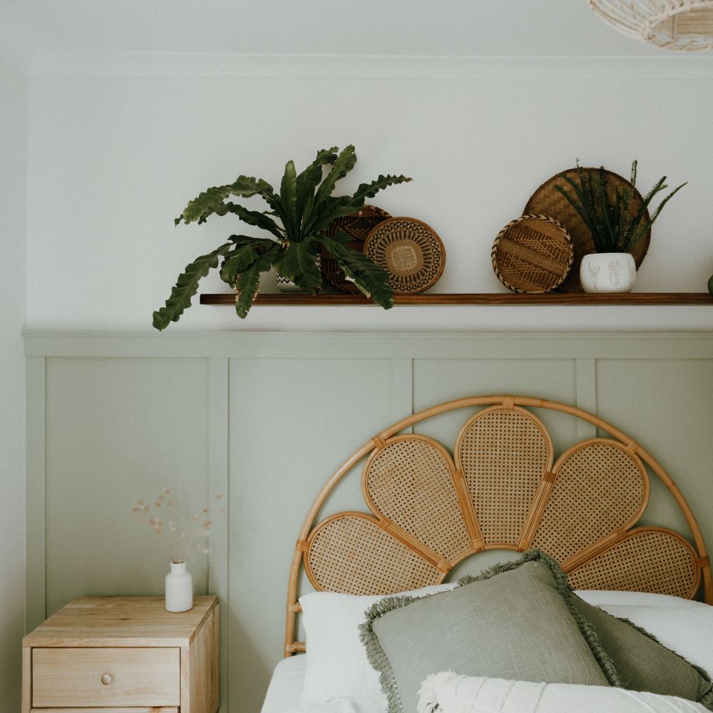
Green is also inspired by nature, bringing life into interiors. The green palette is very broad and offers a wide variety of choices, ranging from sea green to deeper, more vibrant greens like forest green, for example.
The goal of this guide is therefore simple: to show you the shades of blue and green that stand out for your interior.
The different shades of blue
Marie Galante blue
This blue is reminiscent of the sea. This turquoise is made to be combined with other shades to infuse a decor with a natural feel. We recommend using it with greens such as olive green or our Jura fir green.
If you are worried about using two strong colors, you can choose neutrality and go with white or beige to optimize the light on the walls of the room you plan to paint.
The watercolor sky blue
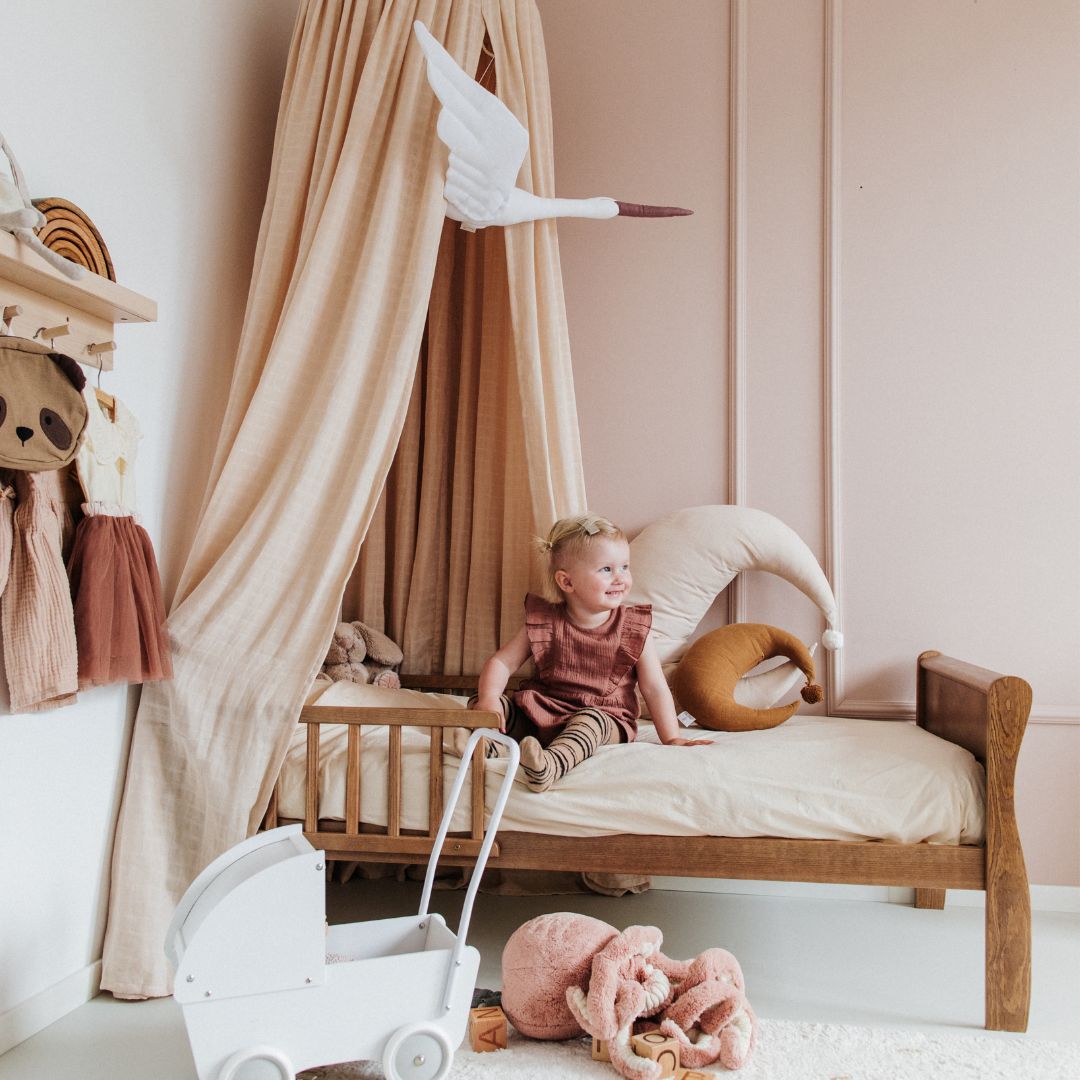
Watercolor sky blue is a popular paint color, primarily because it's a delicate, pastel, and soft color. If you want to maximize the light in your room, using white is a great choice. In more intimate spaces like a bedroom, for example, the palette of combinations is wide.
For example, there's nothing stopping you from using pink to warm up the room.
Duck blue
A particularly trendy color in recent years for your home's interior, it will enhance your decor. It's a shade that will accentuate the dynamism of your room. If it's a much more intense blue than watercolor sky blue, you can pair it with a color like pink, for example.
Before choosing your shade of blue paint, consider how it will look in your room. The existing light, its exposure, and its size will all play a significant role in how the color you use will look.
Before confirming your choice, we recommend using a sample of the shade in question to be sure of obtaining the desired result.
The different shades of green
The playful blue green
A hybrid color between blue and green, this shade works particularly well in bathrooms. Containing a turquoise tone, you can pair it with many shades, although it's easier to use more neutral and soft colors like white or beige.
The green canopy
A color as dense as it is soothing, canopy green can be used to enhance your decor, especially on a section of wall, for example. It's important to use it with a lighter color like cherry blossom beige , which contains a slight hint of pink.
For more daring color combinations, you can opt for natural shades.
Verdigris
As its name suggests, verdigris is a paint that occupies a special place in a color chart. Whether green or gray, this color stands out for its bluish tint. A soothing color, it can be used with bright colors more easily than some other green shades.
This shade is perfect in a living room or lounge.