


Interior paint color is a subject as exciting as it can be important. Choosing a paint color for the walls of a living room is never trivial, especially when it's a room in which we spend a lot of time, which is the case for the living room, and even more so when it serves as a dining room.
There are several reasons why you might choose a color for your living room walls: the subjective aspect is first and foremost, as there are many paint colors that we prefer over others. But color also has an undeniable influence on the mood and character of a room. Choosing a color also gives you the power to transform the ambiance of your room on a section of wall and potentially visually enlarge the space of your interior by playing with the brightness.
The paint will reveal the general atmosphere you want to bring into your interior: an ambiance instilling energy and dynamism, or even a warmer space with warm colors on the walls.
Whether for aesthetic or technical reasons, we will guide you on the perfect paint color for your living room walls.
Important criteria for choosing the color of living room walls
Before thinking about decorating the walls of your living room, it is necessary to take into account the layout of the room and the potential hazards of your interior which will be able to make your living room a unique and personalized place in your home in terms of decoration!
The light and exposure of your living room
The first criterion, which can also be an asset regarding the living room's ambiance, is the natural light your living room can contain. The presence of light will play a role in the paint colors you choose in relation to the living room's decor.
The brighter your living room is, the more you can use warm, deep colors for decorating.
The orientation of the room is also important: depending on whether it is north-facing or south-facing, the projected light will not be the same: for example, a room facing north will reflect a cold light, whereas conversely, a room facing south will reflect a warm light.
With these two elements, you will therefore have some answers on the paint that you are going to use for your walls, on the application in the whole room or on a section of wall only and especially on the colors that you are going to select!
If you want to maximize the brightness of your living room , then we recommend using a satin finish paint for your walls. This is the most suitable finish for walls, while conversely, matte is the most suitable finish for the ceiling.
The size of the living room
As with any room in the house, we recommend using light and bright colors if your living room is small or if you don't have enough natural light to make it look as big as possible (colors like white and beige will be perfect).
Applying light shades will visually enlarge the space and make it more open: this type of paint color is mainly recommended for its ability to restore light in the rooms where these shades are applied.
If you have a living room that's large enough, or one that also serves as a dining room, then you can choose a darker color to define or emphasize a part of the living room! There's no shortage of bright, trendy colors.
The trend in paint color for a living room
While each of us's subjective choices are important when choosing a color, decorating trends are also an important factor. We all want a space steeped in modernity, which is why we're giving you our best ideas for painting your living room with trendy paint colors!
Neutral colors: the most popular
There's no mystery: neutral paint colors are the most commonly used when painting a living room. Neutral colors include beige and white, but gray is also part of this trend when it's light enough.
This type of paint color is primarily known for its versatility: it will adapt to your living room regardless of its exposure and appearance. It is also confirmed that these are colors that will perfectly match any style of decoration: modern, sophisticated, minimalist... This observation applies to all living spaces.
It's simple, bad taste in decorating doesn't exist with these shades, especially since the lighter the shade, the more it will tend to visually enlarge the space within your home. For color lovers, it can be tempting to bring in more colorful tones, that's good, we have for you a range of perfect shades to enhance your living room.
Bold paint colors... but trendy!
When it comes to paint colors, we understand that choosing a shade can be difficult, especially since we offer no fewer than 100 trendy shades!
However, these paint colors should be used subtly. And yes: you shouldn't overdo a good thing. It's customary for the room to contain only one wall painted in a bright shade, and above all, to use only one strong color in your living room so as not to overwhelm it with color.
Discover without further delay our selection of rich and elegant colors that will bring real personality to your living room.
Our color ideas for your living room
Warm white
It's a peculiar white at first glance, but it's one of the most popular shades in our color chart: warm white is, as its name suggests, a warm color. Its real asset is its ability to bring brightness with its slightly vanilla tones, and therefore visually enlarge the living room.
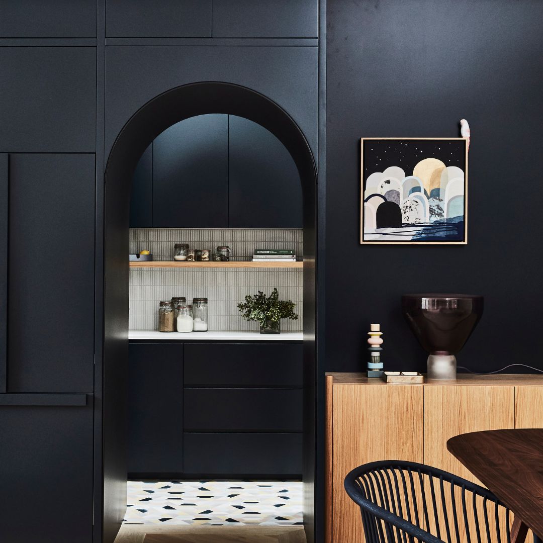
Navy Blue
Navy blue is a shade that transcends time and continues to assert itself over time in interior painting. It will lend a chic atmosphere to the interiors in which it is applied. Blue is a color that easily matches a multitude of different colors and tones, which is a real asset.
For a cozy and sophisticated atmosphere, navy blue paint is what you need in your living room.
You can combine navy blue with warm white, greige or even soft pink.
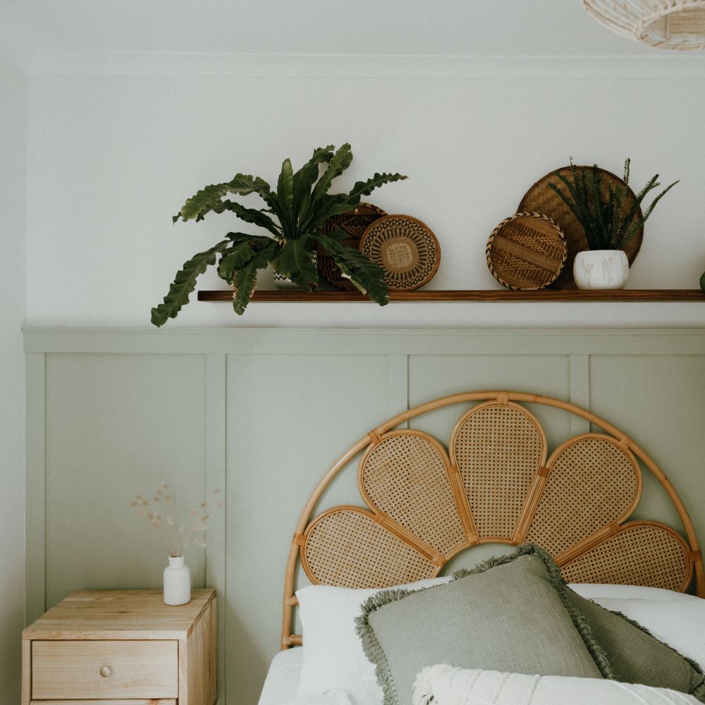
Sage green
A bold paint color, sage green is clearly one of the shades of green that will create a muted yet welcoming look in your living room. Highly versatile, this color can be used in an entryway, master bedroom, or office.
If you want to enhance this shade in a different way for your living room, apply sage green to one of your wooden pieces of furniture to play with the tones already present in your living room.
You can combine sage green with nude beige, soothing sea green, or watercolor sky blue.
Terracotta
Don't look any further, it's the trendy color in decoration in recent years and there's no exception to this rule in painting!
Trendy, warm, and easy-going are the adjectives that define terracotta. Terracotta will be at home in any room. As for the colors with which this shade can be paired, the choices are vast: white for freshness, black for presence, and pale pink for a subtle decorative touch.
Convinced? Our most popular terracotta shade is Madagascar.
Color Missteps to Avoid
No more than three colors in your living room
Choosing is giving up, and it's true that it's not easy to decide between all the colors available when it comes to house paint. But it's still very important to choose the color you're going to use carefully.
Firstly, because too much colour will visually shrink the space in your living room, but also because when it comes to painting, it is important to follow certain rules.
It's particularly recommended not to use more than three shades, which should complement each other. Your color combination should contain only one bright shade; the others should be softer shades. Don't worry, choosing a color for your living room walls can sometimes help define the space if your room also serves as a dining room.
Don't be afraid of color
A bright, saturated color will be lacking in a living room that's too small. Similarly, depending on the atmosphere you want to create in your living room, the choice of color should be considered: for a relaxing space, it's more logical to choose soothing, pastel shades.
Like a pink, a color is not fixed: it is destined to evolve over time and according to the existing light in your living room, so to avoid unpleasant surprises in the decoration of your living room, we strongly recommend that you order a tester or a sample of the shade concerned to compare the effect of the shade on the wall with the one that is liquid in your pot.