

The first thing we think about when it comes to interior design is the color used.
While choosing the colors you're going to apply is a pleasant step in terms of decoration, it's not always easy to plan ahead and choose the perfect color for your wooden furniture.
The color chosen for the wall must be in harmony with the existing wall paint and decorative elements. We offer you some of our customers' creations that will inspire you and help you project yourself among the many colors we offer.At the end of this article, you will know what color to use to repaint your wooden furniture!
The choice of paint and the preparation of the surface above all!
Preparing your wooden furniture is essential to the success of a furniture makeover decorating project: this will ensure you get the best possible result and also ensure that the work is enjoyable.
Checking the condition of the furniture to be painted is therefore the first step before painting your furniture: this involves inspecting for any cracks and rough spots, sanding is an intermediate step to even out the surface and have a smooth surface.
It is also an important element to promote the adhesion of the paint on your furniture.
When the surface is ready, the application of an undercoat will be recommended if you apply Algo multi-surface paint.
When using furniture paint, an undercoat is not required.
There are two main finishes for furniture paint: matte or satin.
The satin finish is known for being shinier, while the matte finish is warmer. Algo furniture paint is only available in a matte finish, which will not affect the maintenance of your furniture.
Once you have painted your furniture, you will be advised to apply a colorless varnish to it to protect your furniture initially but also to add an aesthetic touch: in fact, our varnish is available in a matte and satin finish, guaranteeing a more pleasant aesthetic appearance.
Use tools adapted to your furniture range project
For a successful project, the choice of tools plays a key role: two options are available to you.Initially, the most used option remains the sleeve, more particularly called “rabbit’s foot”: particularly effective on smooth surfaces, it will save you time on your painting project and allows you to obtain a smooth surface
If your piece of furniture is small or medium-sized, using a paintbrush is still a great compromise! You'll achieve a very precise result as long as you don't overload your brush.
Indeed: if your sash brush contains too much paint, it could cause drips onto your surface.
Our color ideas!
This is the aim of this article: to show you some of the things we've done with our furniture paint on our surfaces.We offer you a selection of trendy creations entirely made by Anaïs, a decorator specializing in furniture makeovers and running the Instagram account @ seconde_vie_pour_nos_objets.
Several furniture designs and colors have been created recently, so we invite you to discover them, all in different atmospheres: chic, vintage or modern, everything is represented!
Spoiler alert: Anaïs is crazy about green!
Charming hazelnut beige color
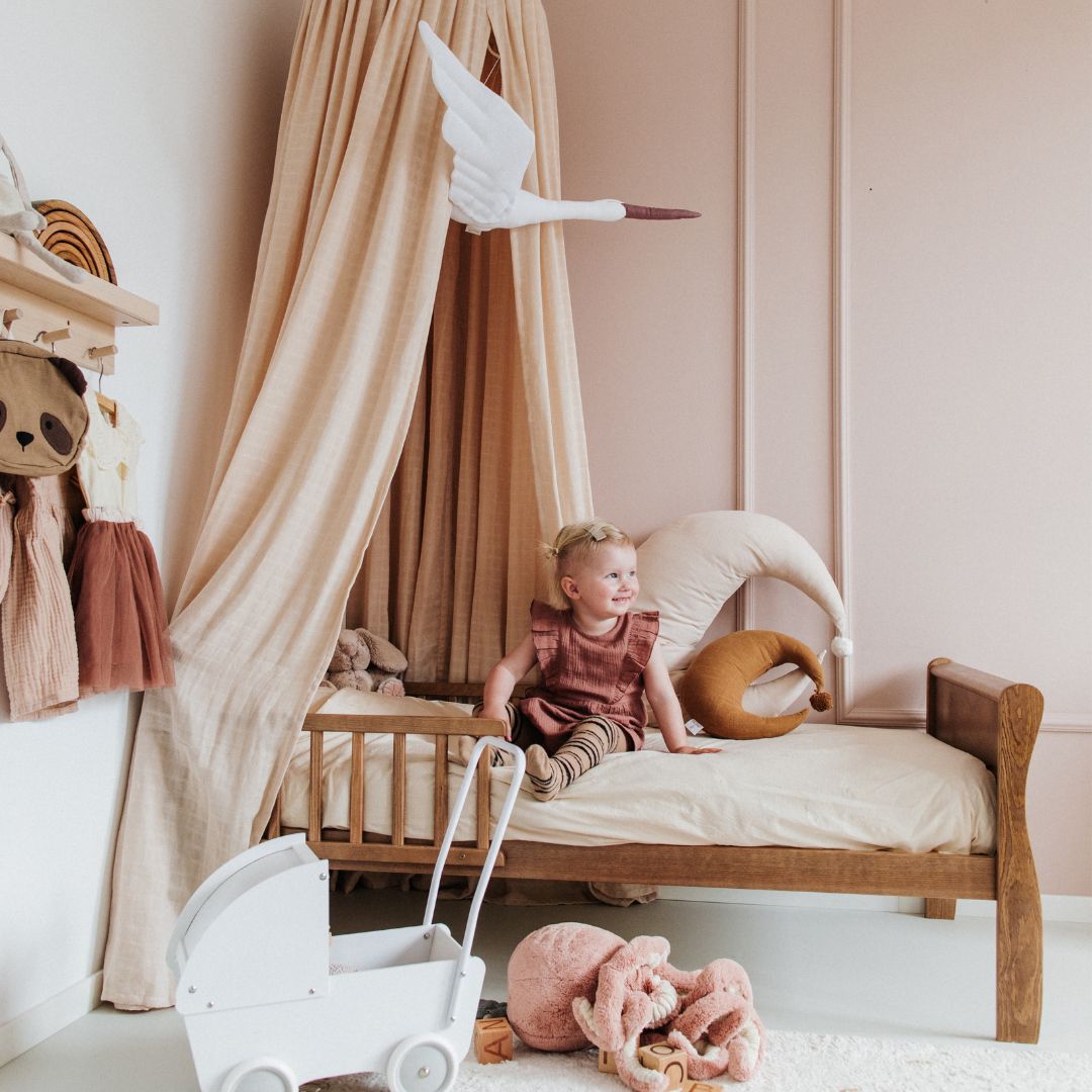
A very soft color, the flirty hazelnut beige is a perfect shade for your walls but also for furniture!Its advantage lies in the sobriety of the color which allows it to be applied to furniture in all rooms of the house regardless of the existing decoration.
In a living room, bedroom or kitchen: treat yourself.

“Original, aren’t they?! 🤩
Intensive sanding for these 2 beauties before painting them in a “coquette hazelnut” from @algopeinture ❤️ “

“ The one I wanted to call the “dream catcher” sideboard 🌠 (I think the drawing on its door looks like it 🙃)
Coming straight from Provence, I had a big blow of 🤍
A crazy job for this one (my back remembers it 😅) Intensive sanding in every nook and cranny, then 3 coats of paint in the pretty “coquette hazelnut” shade from @algopeinture and re-gilding of its original handles ✨
And I'll spare you the details for all the little finishing touches that took me ages 🤪⏳
In short, here it is, ready for a second life 😎”
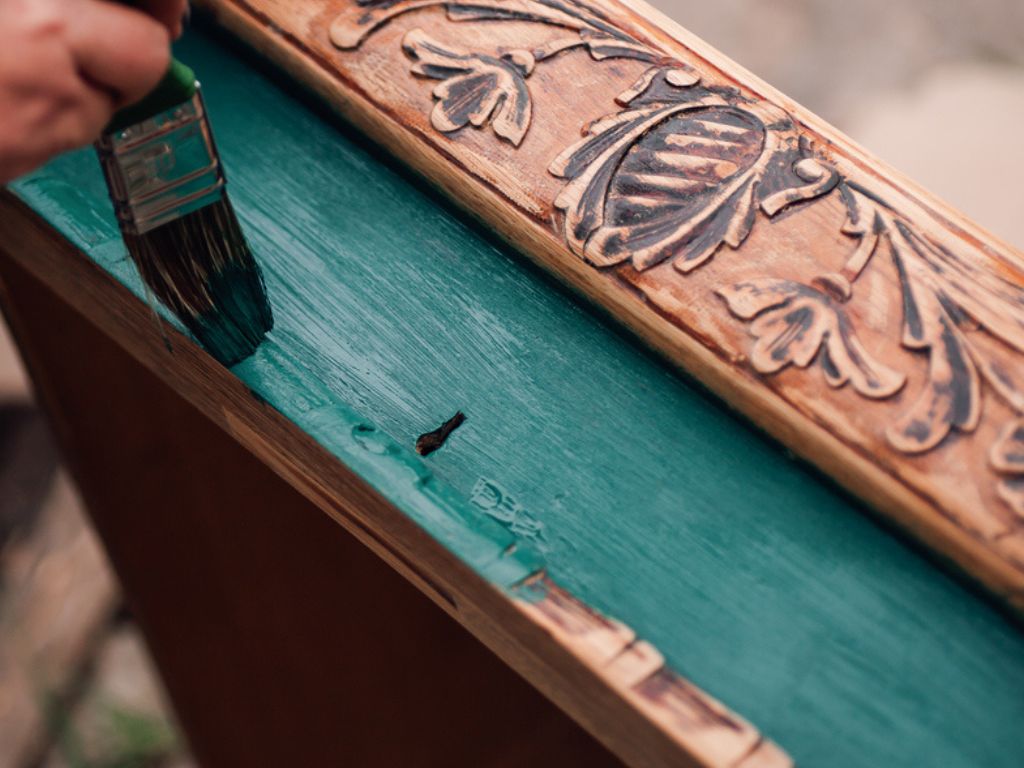
Verdigris color
The verdigris color is a hybrid shade, which as its name suggests is composed of green, gray with a slight hint of blue.
It's a neutral color that's meant to be soothing: it's perfect for enhancing bright colors.

"The cute one in verdigris 💖
Intensive sanding for this chest of drawers, the varnish was very stubborn 😅💪🏼
Then painted in the pretty “verdigris” from @algopeinture 🎨 and re-gilded its original handles ✨
Swipe the photos to see how it was before 🙃
Victim of its success in story, this one has been reserved ❌
Ready to move to her new home
Another one in this style soon available for a renovation of your choice 😜
Contact me by message for more information 🙃 "

"The cute one 🤍
Sanded then repainted in the verdigris from @algopeinture and here it is ready to find a second life 🤩
Swipe the photos to see how it was before 🙃
So you like it?! 😍 "
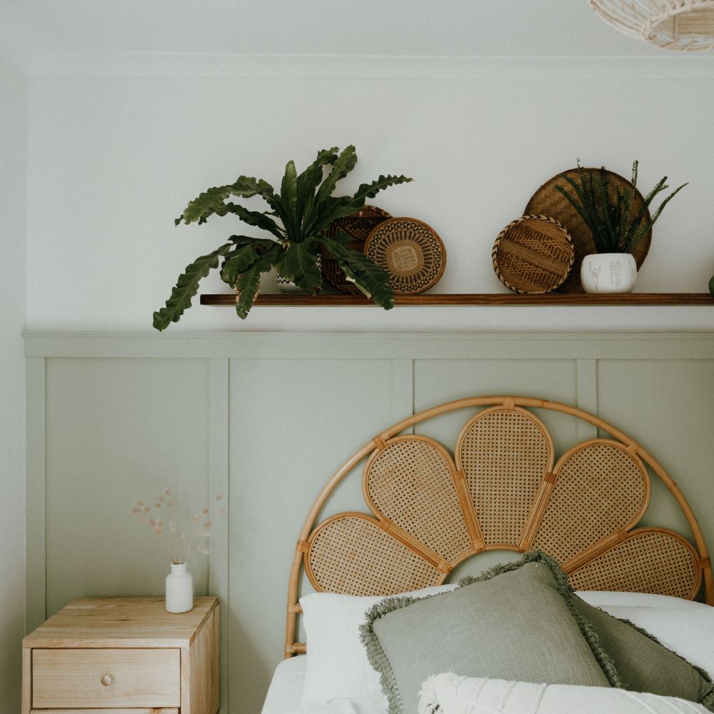
Landes sage green color
It's a particularly trendy color right now: sage green is a shade of green subtly enhanced with gray to complement your decorative elements: it's the perfect shade to bring calm and elegance.
It is a green that is very natural, which stands out from the more vivid variants of green.
Depending on its use and the elements it is associated with, sage green can have a slightly grayish tendency.

"A big 💚 for this one I found at my famous flea market in the Vosges!
Completely sanded and revisited in a “landes sage green” from @algopeinture , raw wood base and top + application of the colorless matte wax that I love @vintagepaintfrance ✨
This one will fit in a bedroom as a nightstand @moony.8 🥰
Swipe through the photos to see how it looked before! 🙃
And you, how do you find it?! 🤩 "

"Bedside table, occasional furniture, end table, call it what you want 🙃 It will find its place in your interior with its pretty "landes sage green" color from @algopeinture 🎨
Completely sanded before painting and re-gilding of its original little handles 🤩
Swipe through the photos to see how it was before! Nice difference, isn't it?! 😜
He's cute, he's ready for a second life! 😍 "
Almond green color
The 3rd shade of green highlighted in this selection: almond green is a fairly discreet green: warm, this green symbolizing a reminder of nature will go with everything and will be perfect with the existing decoration.
Anaïs renovated a sideboard with this shade to the delight of her interior.

"A big 💚 for this Parisian buffet, the famous, the emblematic! This one has been renovated in a pretty "almond green" from @algopeinture
Ideal in a kitchen or even in an entrance hall or even in a living room! It will bring a crazy charm to your interior 🤩
Slide the photos and especially see how it was before 😜
So you like it?! 🙃 "
These different examples can be completed by many other combinations or other supports which are not highlighted in these decorative examples.
It is also possible to paint cabinets or tables.