

Collection: Eco-friendly pastel blue paint

-
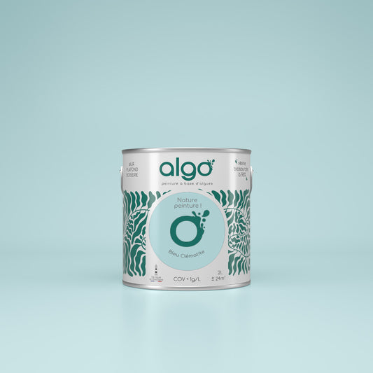
Algo Eco-Friendly Paint - Clematis Blue
Regular price from From 24,10 € ttcRegular priceUnit price 52,40 € ttc per l -
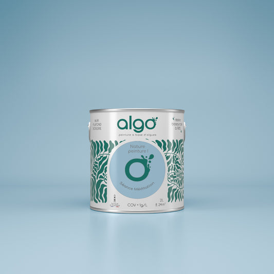
Algo Eco-Friendly Paint - Meditation Session Blue
Regular price from From 24,10 € ttcRegular priceUnit price 48,20 € ttc per l -
Algo Eco-Friendly Paint - Watercolor Sky Blue
Regular price from From 24,10 € ttcRegular priceUnit price per

Choose your colors with ease
-
Find the perfect shades with our color consultant
Book your free coaching -
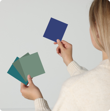
Easily choose your shades with our samples
See our 100 samples -
Fall for our magnificent color harmonies
See our color harmonies


-

Fast delivery
and neat -

A service
top customer! -

More than 2000
verified reviews -

Payment
secure


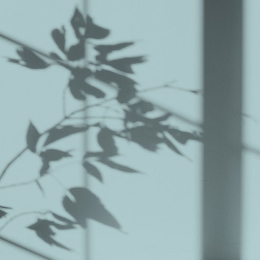
The light blue colors of our color chart
Watercolor Sky Blue - a soft and light pastel blue
This is the most pastel shade of blue in our color chart. A very light shade, watercolor sky blue has the significant advantage of being able to be applied in any room of the house. The added bonus is that its soft, neutral color allows it to be considered as a total look or combined with other paint colors from our color chart.
Clematis Blue - a modern and subtle light blue
A color that brings serenity, clematis blue is a subtle shade that is enhanced with a hint of green and gray, which makes it unique.
A soft and trendy color, clematis blue is the perfect color for lovers of softness.
Blue meditation session - color synonymous with calm
A soothing color, meditation blue comes with a touch of gray that will add character to the room in which it is applied. A pastel blue color with a neutral element, it will be a perfect asset to bring a calm and serene character.
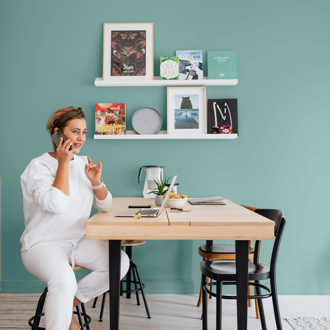
Kitchen, living room: the rooms where you can apply pastel blue to your walls
Pastel blue stands out for its soft and light attributes, it is by definition applicable in the vast majority of rooms in the house.
There are several possibilities for using pastel blue paint in your interior: applied as a total look in a kitchen for example: contrasting with originality and sobriety.
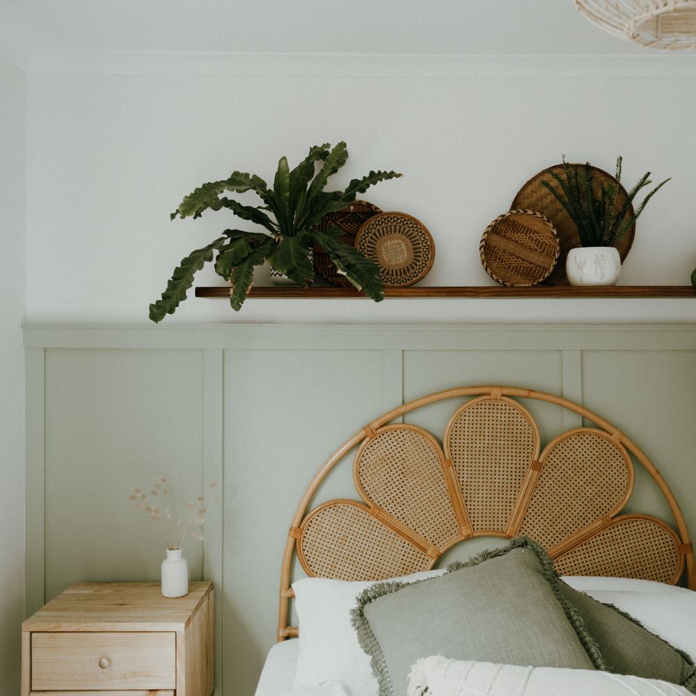
In a living room or bedroom, it is a color that can be perfectly harmonious and applied to a section of wall, for example, to add character to your room.
Decorating tip: what color should you pair with pastel blue?
As we mentioned, pastel blue is a very easy color to apply and, above all, to combine. The tone and discreet character of this color allow it to be imagined with more neutral colors as well as more contrasting shades.
As for our watercolor sky blue, for example, it can be combined with a warm white to accentuate the brightness of the room.
To create a warmer atmosphere, a stronger paint color can be considered: such as brown for example.
For the more daring, other combinations are possible: used with fir green paint, the softness of a pastel blue will highlight the green, creating a very aesthetic contrast.