

Collection: Orange eco-friendly paint


-
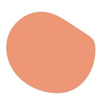
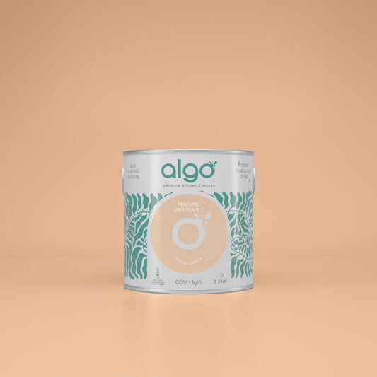
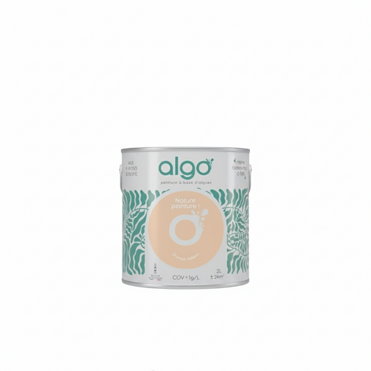
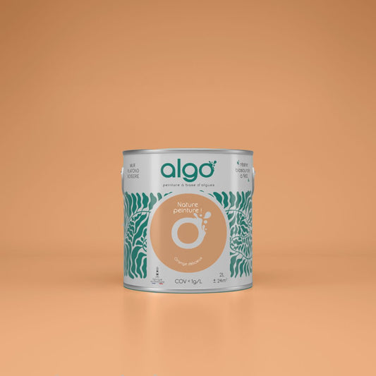
Algo Eco-Friendly Paint - Radiant Orange
Regular price from From 23,50 € ttcRegular priceUnit price 47,00 € ttc per l -
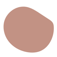
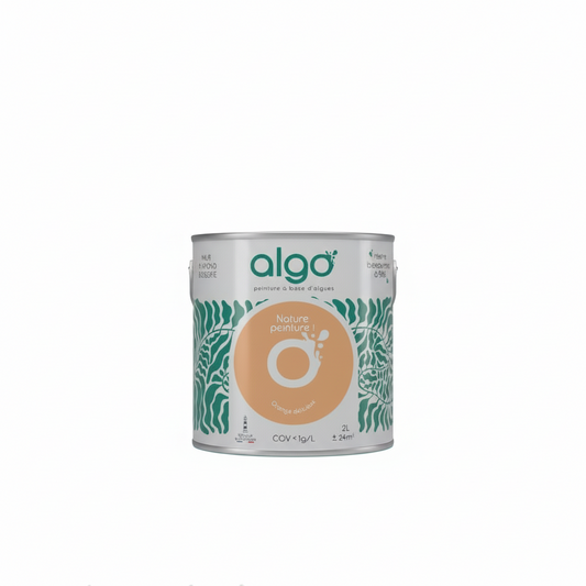
Algo Eco-Friendly Paint - Delicious Orange
Regular price from From 23,50 € ttcRegular priceUnit price 47,00 € ttc per l
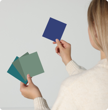
Choose your colors with ease
-
Find the perfect shades with our color consultant
Book your free coaching -
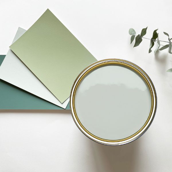
Easily choose your shades with our samples
See our 100 samples -
Fall for our magnificent color harmonies
See our color harmonies


-

Fast delivery
and neat -

A service
top customer! -

More than 2000
verified reviews -

Payment
secure


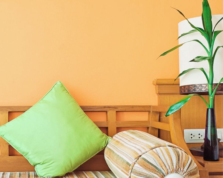
Widely used in the sixties, the color orange has always found a place in paint color charts.
It is true that a color can completely change the atmosphere of a room, and orange is one of those colors that will not leave you unmoved, no matter what.
The color orange comes in a multitude of shades, ranging from pastel to dark. Discover our selection of orange shades.
Orange, a dynamic color
If you're looking for a color that symbolizes warmth and inspires dynamism to fuel your decor, then orange is the color for you. The color orange goes beyond aesthetics and will bring you positive emotions.
A color known for its energy, orange will be a major asset in special rooms like the office or in spaces where people exercise, for example. You will therefore have a greater interest in targeting the rooms in which you will apply orange paint.
Another advantage of orange: its ability to be a source of sociability, promoting a welcoming climate.
Our different shades of orange paint
Wanting to apply orange in your interior is already a first step, but you must keep in mind that the orange color in decoration comes in a multitude of colors ranging from very light orange to terracotta.
A subtle blend of yellow and red, the shades of orange can also vary between these two colors.
Radiant Orange:
Natural, warm and luminous color: what more could you ask for? A fairly strong orange, it is considered salmon, subtly enhanced with a hint of pink.
A shade that can be associated with nature through its earthy touch, this shade adapts to terracotta colors or even earthy pinks.
Mischievous Fox:
pure orange par excellence, it is true that it is a shade that will not be easy to apply.
However, it is a vibrant and flamboyant color that has its place in your interior.
This very strong color will be even more highlighted when applied sparingly with more neutral colors to assert an elegant positioning.
Kahouanne:
This warm shade is reminiscent of terracotta tones, with a touch of pink.
It can be used in any room of the house: welcoming, warm and rather favored by its earthy tones, which are currently very fashionable, Kahouanne is a real alternative.
Weekend Brunch:
A fresh and light shade, our weekend brunch shade is a modern color: it can be applied as a total look or as a secondary color depending on the feel you want to give to the room.
Yellow and pink colors will be the colors to favor to associate this beautiful orange.
In which room should I apply orange?
Before you begin applying the paint, consider the room's environment and existing decor, which may be more or less conducive to the application of orange.
Lighter tones will open up the space, while darker ones will be more suitable for larger rooms or used in small touches to add sophistication.
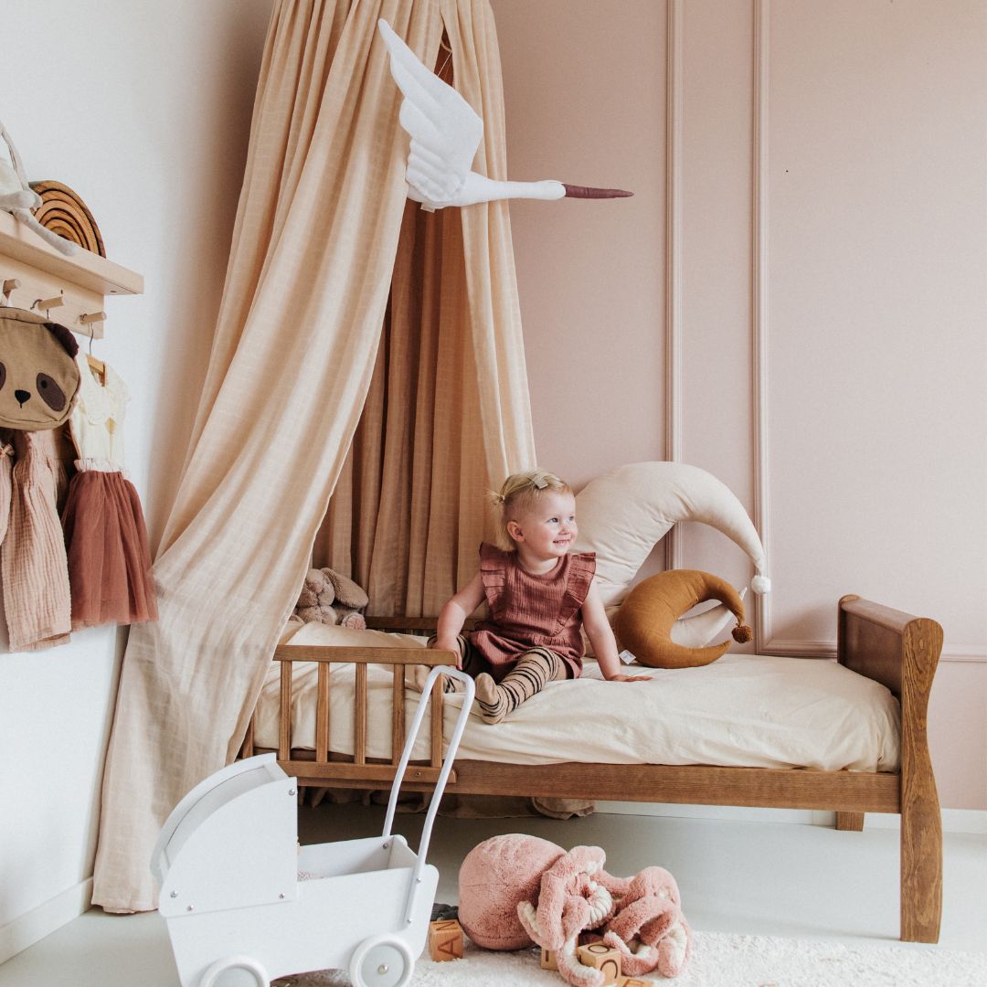
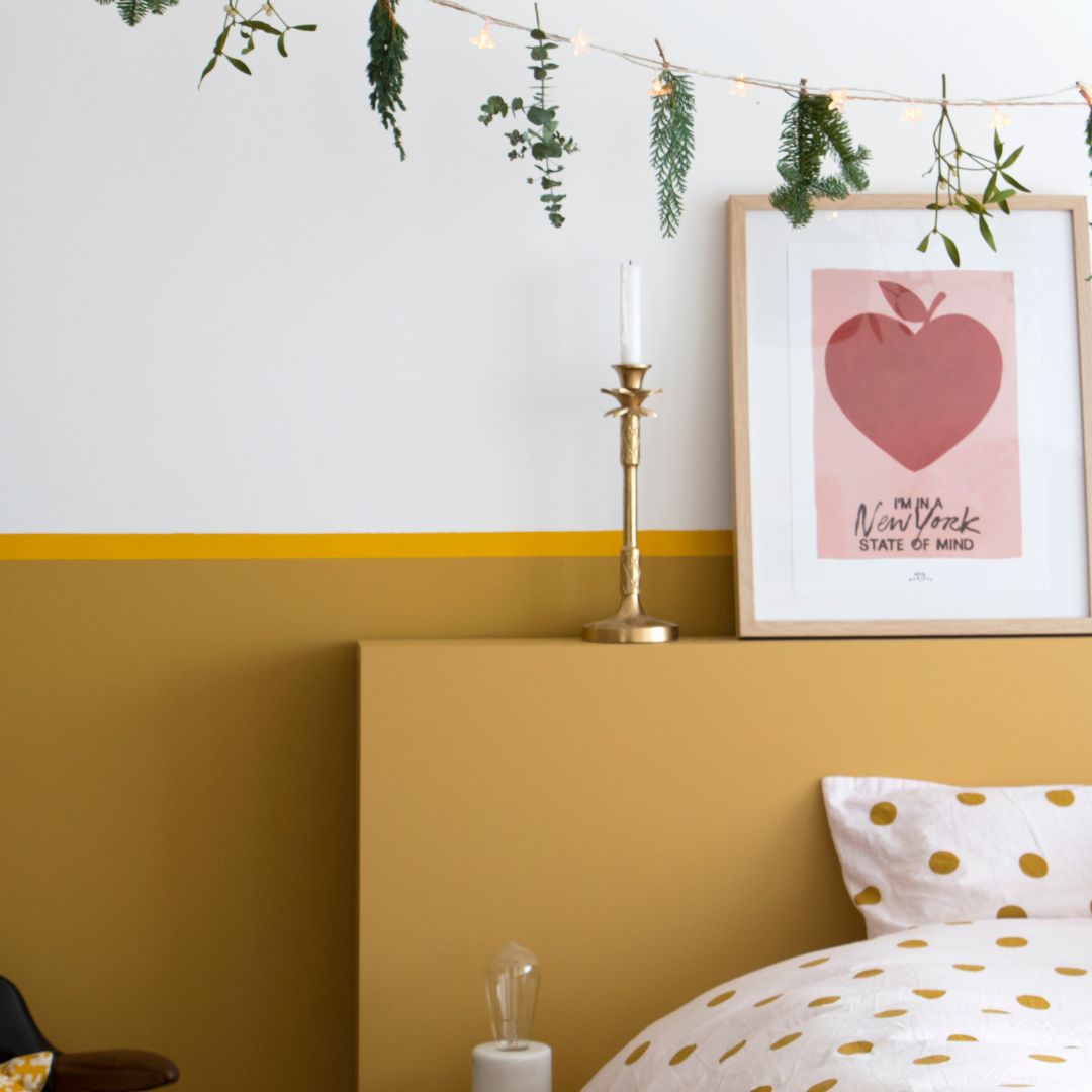
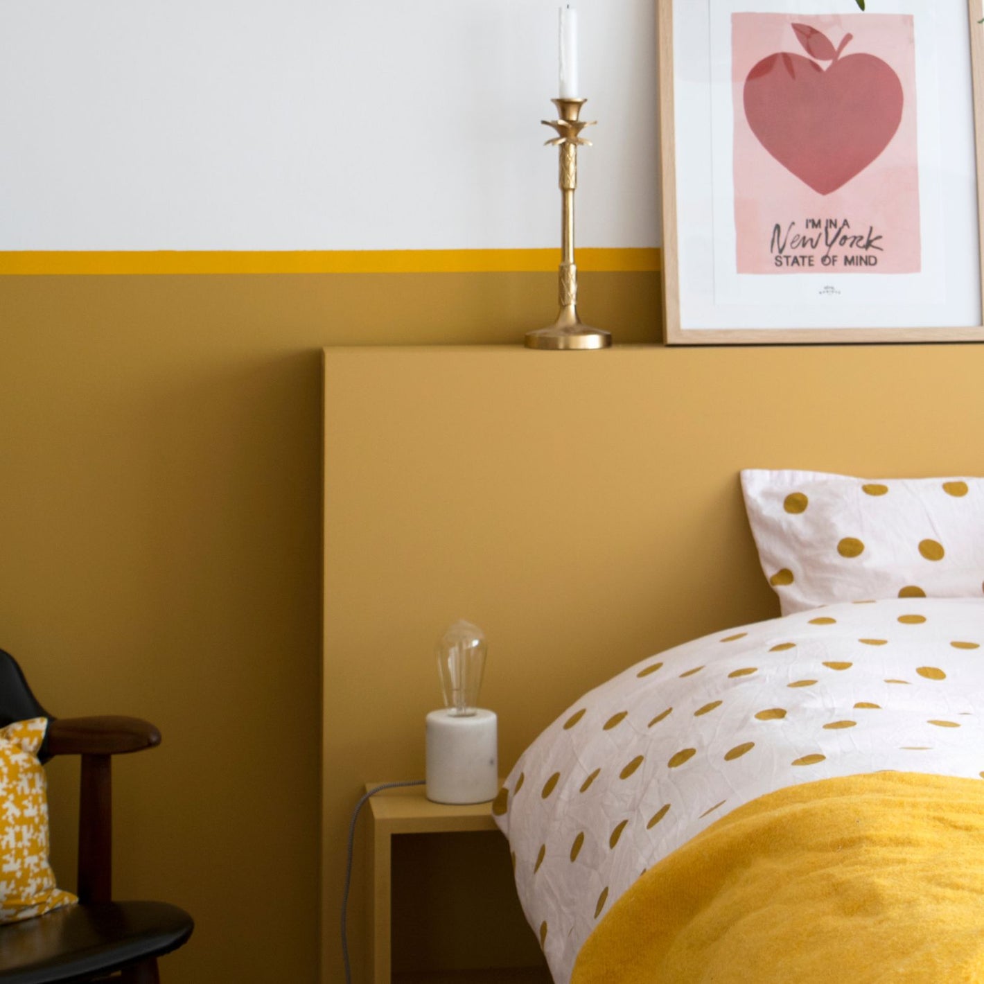
The bedroom:
Softer tones are recommended because they promote relaxation. Our recommendation is therefore oranges tending towards yellow.
It's also easier to imagine the orange paint on a single section of wall so as not to overwhelm the visual effect of the shade too much.
Orange is a bright color, so using overly bright tones is not necessarily recommended.
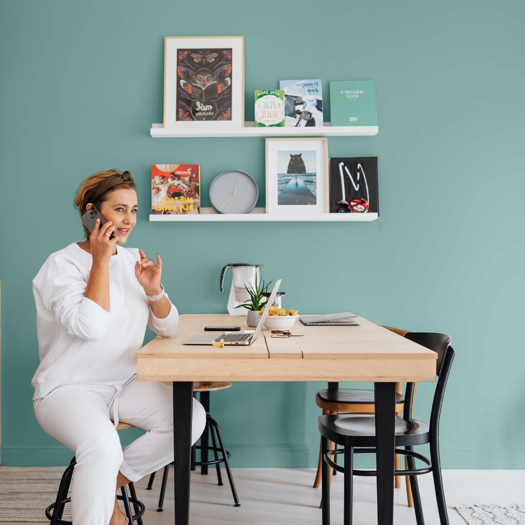
The living room:
Dynamism will be the key word for orange in your living room. This is the room where you can experiment with more vibrant orange combinations. Used in small touches, it will be even more enhanced while also adding a sophisticated touch.
You will definitely gain in conviviality!
To balance the visual impact of the colors on your walls, combine orange with more neutral shades to enhance the overall effect.
The office:
Orange stimulates the mind and promotes creativity, which is why it is possible to try the orange color in an office.
However, as with the bedroom, overly bright tones will not necessarily be the most recommended, or only in moderation!
What color should orange be paired with?
Orange is an uncompromising color that often requires pairing with other colors.
While it may be difficult to imagine orange as a total look, keep in mind that you can combine it with a few shades from the color chart to achieve a balanced harmony.
Blue, green and neutral tones like white and beige are winning colors to pair with oranges.
White:
White is preferable if you want to use bright tones: the contrast of the two colors allows for a balanced harmony and does not visually saturate the room.
While standard whites may be suitable, more modern whites, such as warm whites, are also popular and more personal. These warm shades remain a perfect alternative.
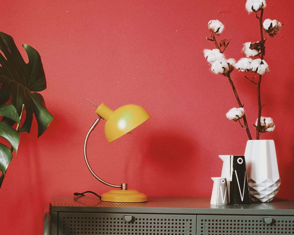
Blue:
Deep blues pair well with orange hues. For a balanced color scheme, opt for a soft orange so the blue can enhance the impact of the color in the room.
Beige:
This is another "neutral" alternative to white. Beige is more colorful and warmer than white, and certain shades leaning toward yellow will make it easier to harmonize with orange.
The cream beige or Oléron beige from the Algo range are real alternatives.