

Collection: Midnight Blue Eco-Friendly Paint

-
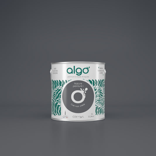
Algo Eco-Friendly Paint - Dark Summer Sky
Regular price from From 0,00 € ttcRegular priceUnit price 52,40 € ttc per l -
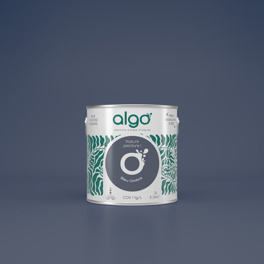
Algo Eco-Friendly Paint - Shadow Blue
Regular price from From 0,00 € ttcRegular priceUnit price 52,40 € ttc per l -
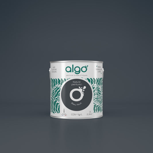
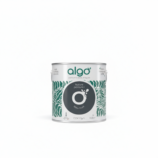
Algo Eco-Friendly Paint - Midnight Blue
Regular price from From 0,00 € ttcRegular priceUnit price 52,40 € ttc per l
Choose your colors with ease
-
Find the perfect shades with our color consultant
Book your free coaching -
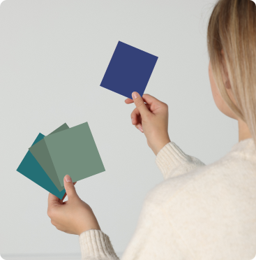
Easily choose your shades with our samples
See our 100 samples -
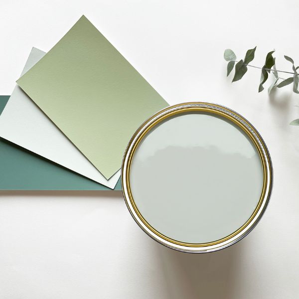
Fall for our magnificent color harmonies
See our color harmonies


-

Fast delivery
and neat -

A service
top customer! -

More than 2000
verified reviews -

Payment
secure


Timeless, its versatility is also a real asset of the midnight blue color .
Although the captivation communicated by the color should be enough to adopt it, we will give you all the keys to be able to use all the advantages of midnight blue in your interior: from the rooms in which you can use it to the colors with which you can associate it.
Choose the most natural midnight blue paint possible
There must be as many midnight blue paints as there are paint brands, and for good reason: this blue is a must-have, especially since it's very trendy in interior design at the moment.
The question then arises: which brand should you trust when it comes to midnight blue shades?
We believe that two criteria are important when choosing the right brand of paint for your midnight blue.
Undeniably, the first aspect is the quality of the product that you are going to apply to the walls of your interior.
Midnight blue is a deep and vibrant shade , which means that the paint used must be sufficiently opaque to provide even coverage on your walls, regardless of the application method (roller or spray gun).
It is therefore important to find out about the coverage offered by each brand. By promoting algae in our composition, we are able to offer a midnight blue paint that provides even coverage from the 2nd coat with the possibility of applying a 3rd depending on the surfaces and the application method.
The second aspect lies in the overall composition of the paint. You might not know this, but paint is mostly composed of chemical elements - up to 60%, for example, for a "water-based" paint.
To preserve the quality of the air in your home and also your health, it would be wiser to choose a natural paint that will release less than 1g of VOCs per liter and which will be as ecological as possible.
If in doubt, do not hesitate to consult the technical data sheets and the data and safety data sheets.
Our 3 tips before painting with midnight blue
Midnight blue is a fascinating shade with almost nothing but positives. However, our advice will help you choose midnight blue paint with full knowledge of the facts.
-
Midnight blue is a deep shade
As you know, applying paint to a full-size surface won't have the same feel as applying it to a color chart or sample. It's therefore important to be prepared for the color applied to a surface to visually saturate your space.
But don't panic, because midnight blue is a paint that is applied in combination.
-
Pair midnight blue with other shades
Yellow, beige, light gray or even white : it will be almost essential to combine midnight blue with other shades to channel the depth of the nuance.
Our color consultant Anne-Sophie recommends not exceeding 3 colors and especially not using the strongest shade in the combination in the majority.
-
Take brightness into account
The color will not appear the same depending on the room in which the midnight blue is applied. The same is true depending on the brightness of the room.
Our advice: use it in a room that is sufficiently lit so as not to darken the room.
In which room should you use midnight blue?
The real plus of midnight blue is its versatility, which is a real asset for a bright shade. No nasty surprises or bad taste, then: you can use it in every room of your home... although it's true that we have our recommendations!
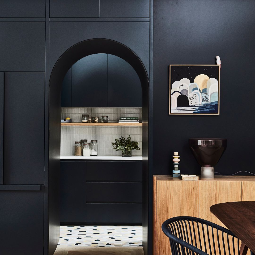
In the living room and dining room
Sophisticated and chic , midnight blue will add character to your main living space! Intimate and welcoming, it reflects all blues with this additional depth that will make it a powerful ally to reconcile with your existing decoration.
In our opinion, light wood furniture and metal lighting are the elements of the perfect combination.
At the risk of repeating ourselves, use it on a section of wall only to create a point of balance.
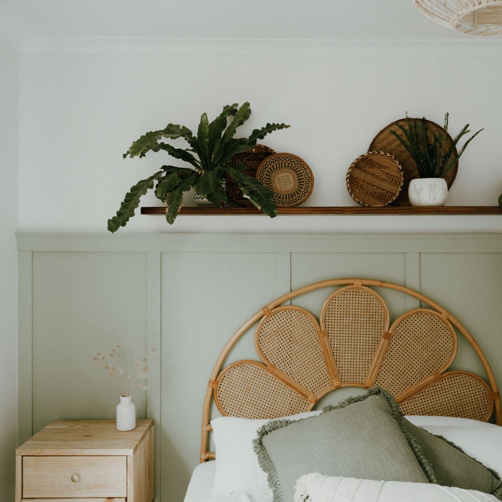
In the master bedroom
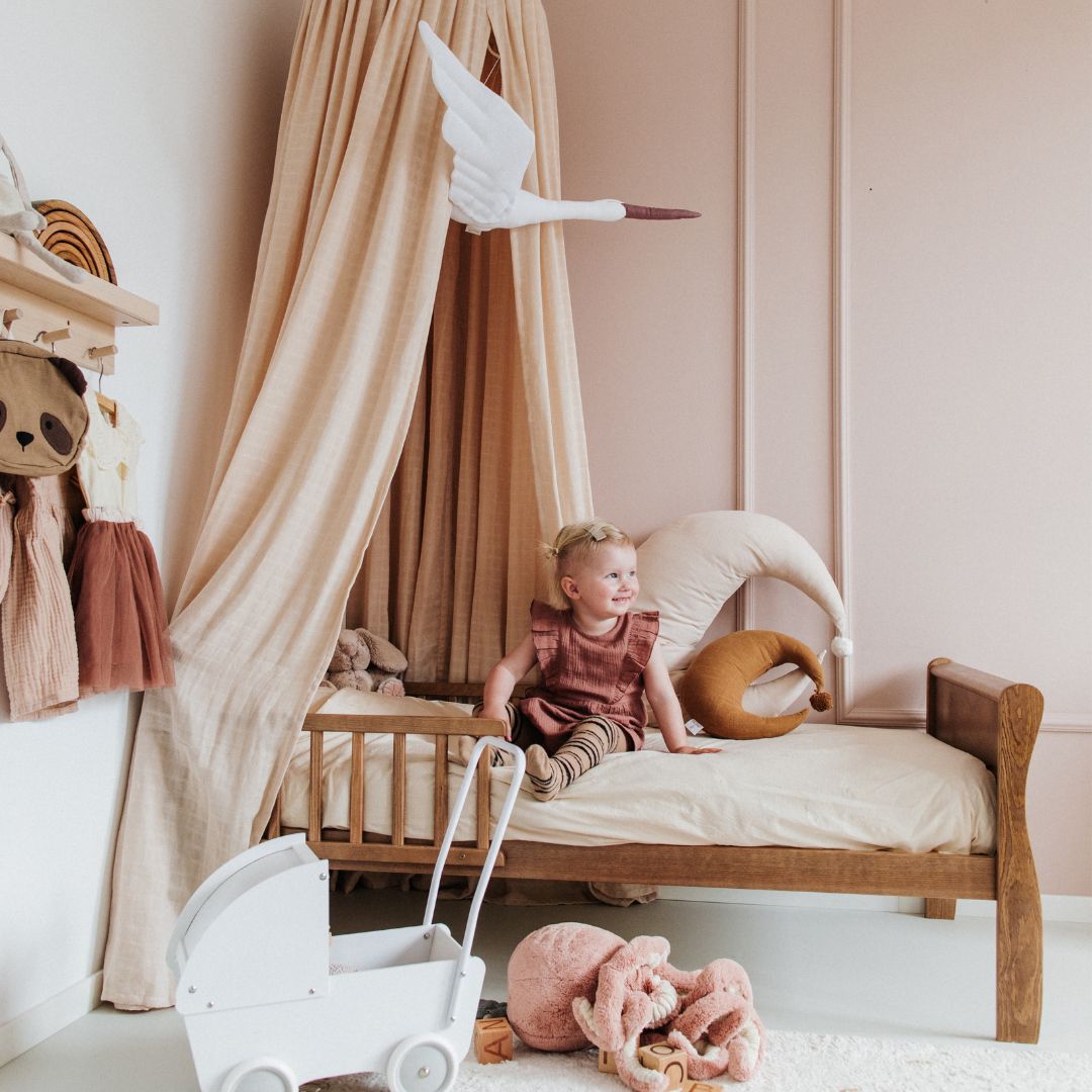
Soothing and relaxing, what room other than the bedroom can accommodate midnight blue? This shade will promote sleep and tranquility. It will be perfect above a headboard and wooden furniture.
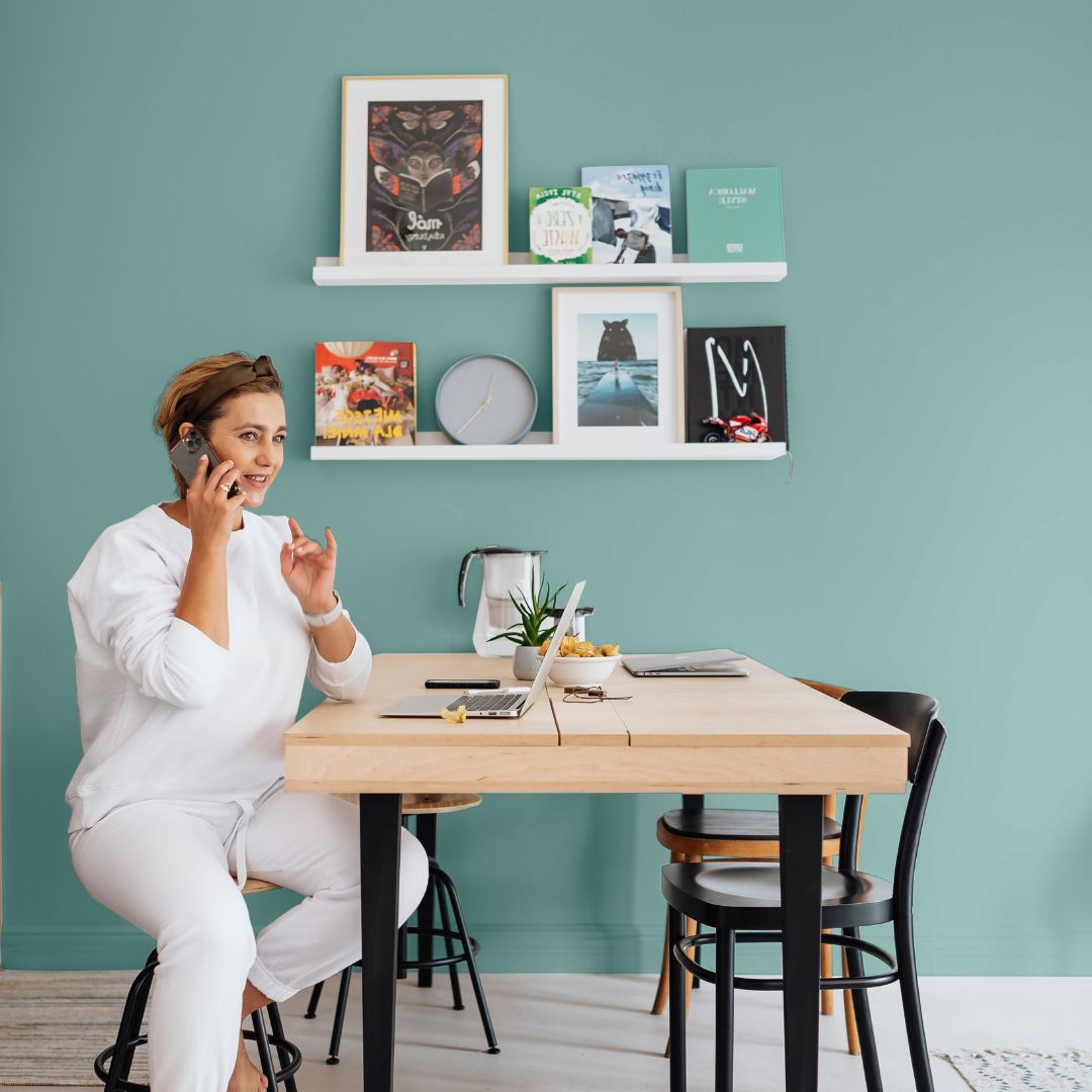
In the office
Work habits are changing, and more and more of us are working from home.
Balancing professional and personal life can be difficult, just as it is difficult to designate a space dedicated to teleworking when you don't have a room dedicated to teleworking.
Midnight blue will be a strong color to demarcate this living space and promote concentration and tranquility.
What colors should midnight blue be combined with?
As for its use in the rooms of the house: the versatility offered by midnight blue gives you a wide palette of colors that can be combined with this color.
The white
Don't think of white as a default choice, quite the opposite. Midnight blue is a very bright shade that needs to be contrasted with a lighter shade. White is the lightest and most neutral shade possible , so it's a perfect compromise.
Its use is even more useful in small rooms or in spaces where natural light is absent because it will help to break the darkening of the space that midnight blue will undoubtedly cause.
Beige
Using beige allows you to use color while controlling its impact. Beige will also enhance the midnight blue, even if it's used in a minority of rooms.
Among our beiges, we will rather recommend light tones like Cherry Blossom for example, which will be delicate with a very slightly pinkish hint that will not leave you unmoved.
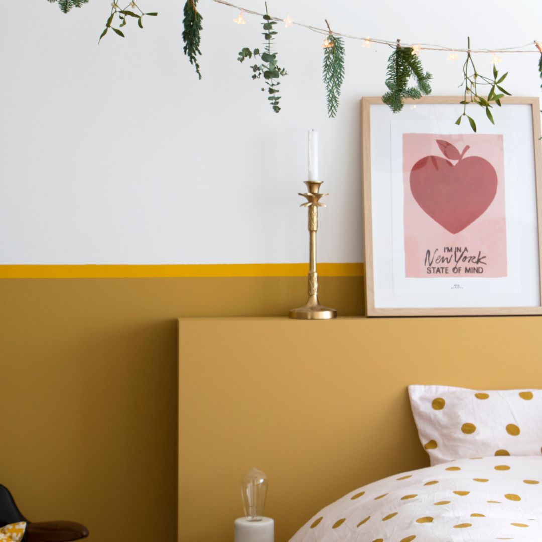
Yellow
No, using a color other than midnight blue in the same space is not necessarily a risk.
Yellow is the color of sunshine and joy of living , and can therefore only be combined with blue, which promotes calm and peace.
Beyond a classic association with an association on sections of walls, these two colors can be associated on geometric shapes of the same wall or to mark a particular place in the room.
Some technical tips
Midnight blue is applied like any other color in the color chart: with one coat of primer and two top coats , sometimes three depending on the desired intensity.
We offer it in all possible finishes: namely matte, satin or velvet .
For the decor aspect, we will mainly consider satin and velvet for the walls of your home. These aspects are all the more popular in terms of decor as the finish accentuates the brightness of the space.
In more sensitive spaces, the washable aspect is a real plus that the satin finish allows.
Some rooms with sloping ceilings or attics can legitimately have their ceiling painted in color: in this case, matte will be more suitable.
This shade can be painted with a roller or spray gun, with recommended dilution of up to 5% with a roller and 10% with a spray gun.